Harvest: Onboarding with warm and weird illustrations

Problem
How could we use illustrations to make Harvest, a densly packed productivity app, feel less intimidating for an first-time user?
Challenge
Harvest didn't have much branding in terms of illustration so I didn't know what tone or style users would prefer.
My role
- Worked with a product manager to define section goals
- Ideation and illustration
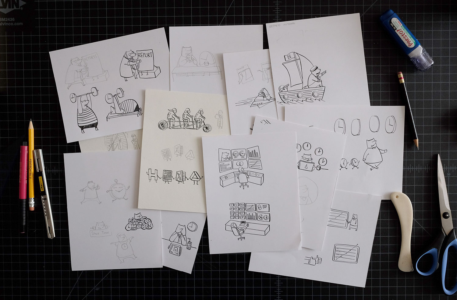
Sketching to start
To start, I developed 4-5 sketches for each section that ranged from very serious to very goofy to see worked best.
Considerations
When deciding what direction to take these illustrations, I kept these principles in mind:
Build a narrative
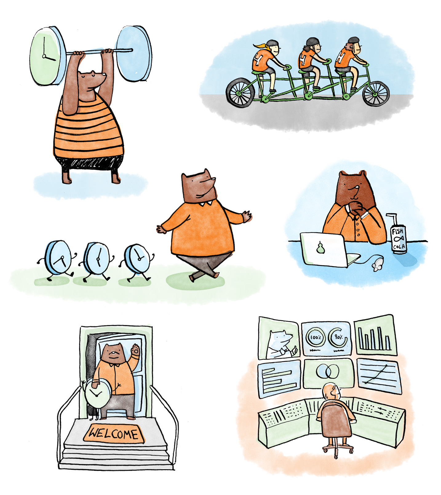
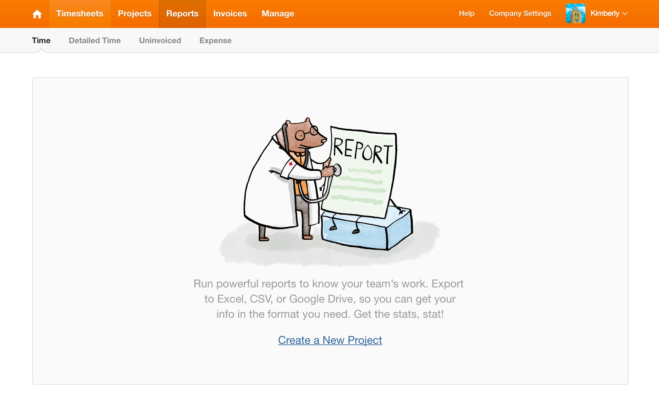
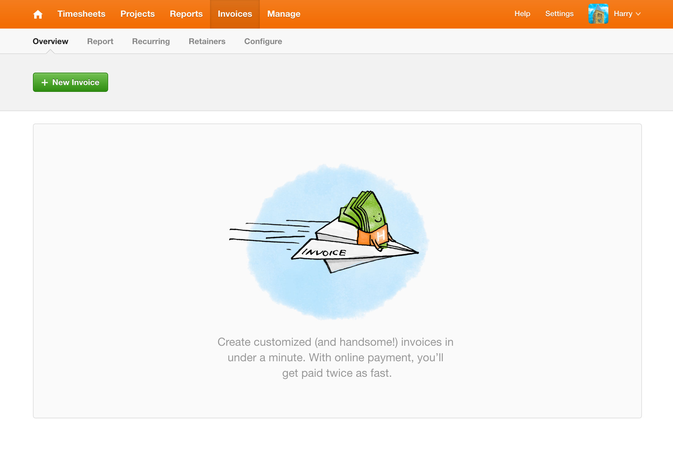
At Harvest, we always thought our spirit animal was a bear so I relied on that and caricatures of time to drive the narrative.
Strike the right tone
Harvest is a business tool used by small businesses and freelancers so I wanted to make the illustrations fun without being too silly or negative.
Use a handmade style
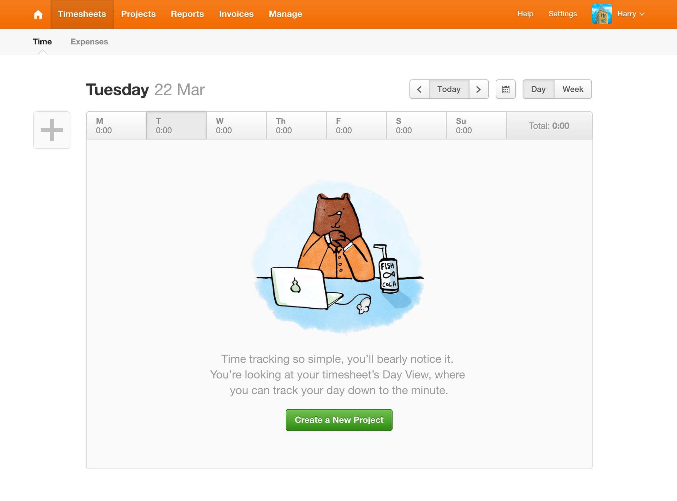
I intentionally kept my drawings loose to visually offset the app's design which is more rigid. It created a nice tension that drew a user's eye in.
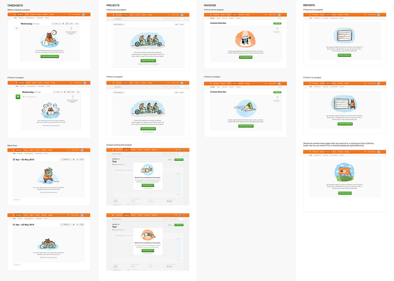
Making sure everything worked together
When presenting options to the team, I placed the illustrations together in context of the app:
Final illustrations
This was a really fun project that let me flex my illustration muscle. All in all, this project took 3 weeks and I delivered 10 drawings that are now live on Harvest.
Some of my favorite onboarding illustrations
Harvest and I both love a good visual pun, so thankfully many of those types of drawings were included in the final cut.
Learnings and lessons
- As an illustrator, I learned how important humor, abstraction, and narrative play into a user's first time experience
- We didn't test into these drawings and I'm grateful for that. We were able to launch with a voice that felt like it came uniquely from Harvest.